One of the most important rooms in any home is the Living Room. It is the first space any guest to your home will see, the place where you can spend casual evenings after dinner, and a great many other things. When decorating your living room it is easy to think that it is as simple as just putting in a sofa, coffee table, and some books, but there is actually a lot more thought that can go into it! I can't tell you what is the perfect way for you to design yours, but here are 15 of the most common mistakes to avoid.

Within a space one of the first things you will notice is the effect the lighting has, even if you don't notice the light fixtures themselves. This lack of attention to the light fixtures is why this is the most important thing to think about! Lighting sets a mood, so make sure you have multiple different fixtures to be able to change the space as needed.
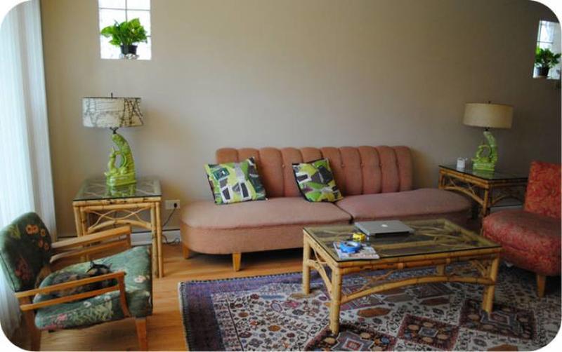
With any living room you never want it to feel too empty or too crowded, more like a comfortable inviting space for family or guests. By having a rug that is too small you give it a first-apartment-we-can't-afford-furniture feel, so avoid that by picking a rug that fills the space, but not more than the furniture does.
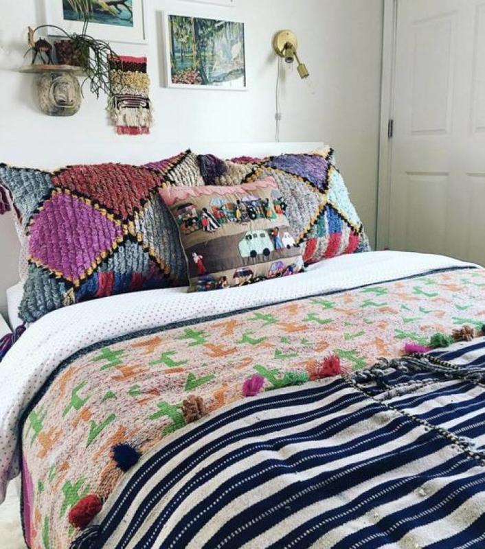
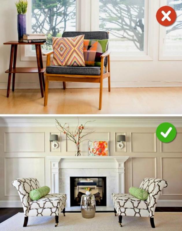
While the main functional purpose of cushions is to make seating more comfortable, they are an important part of the look of any space. When you pick cushions think not only about their functionality, but also how they will play into the look so that you can avoid terrible clashing situations like this one.
Although some would think the best way to keep space open is to push the big pieces against the wall and leave the center space blank, that is not always the best plan when you are working in a large space. If you are able to have the sofa and tables off of the wall you will break the room into more spaces for moving.
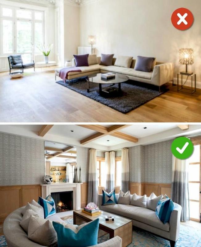
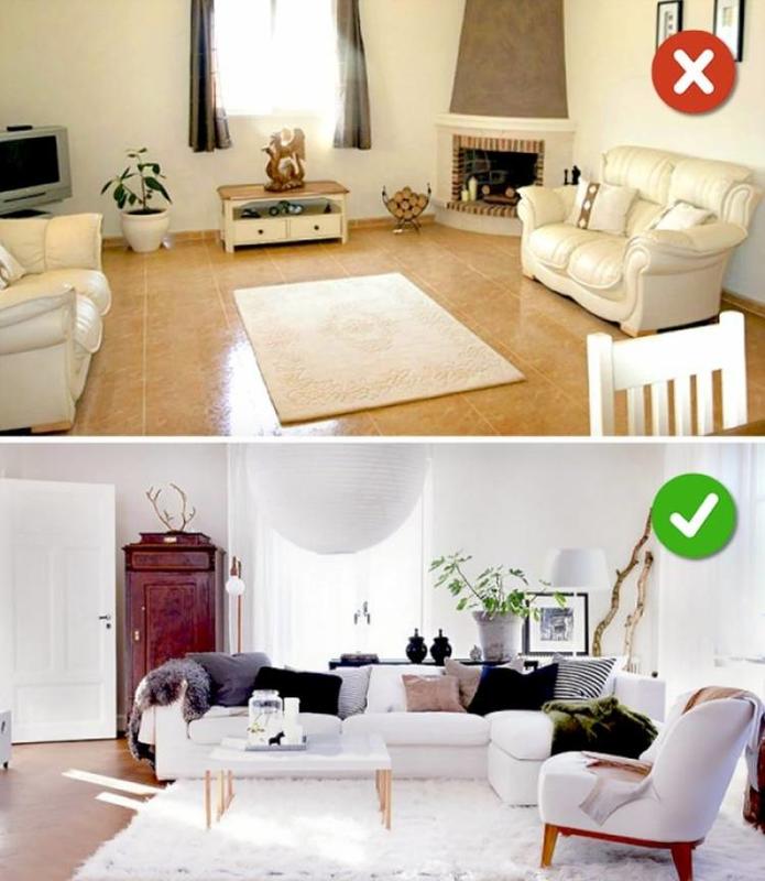
A simple rule is that dark colors make anything look smaller. That's why little black dresses are so popular! But unlike with waist size, you want to make a room feel as big as possible. To avoid visually shrinking your space make sure that you choose light wall colors and furniture to keep any space as big as possible.
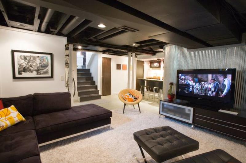
Although having a space look good in general is important, what is more important is that it looks good to you! The people who are living in a space are the biggest factor in deciding its functionality so when deciding how to decorate take a second to think about how you and anyone else living there will feel in it.
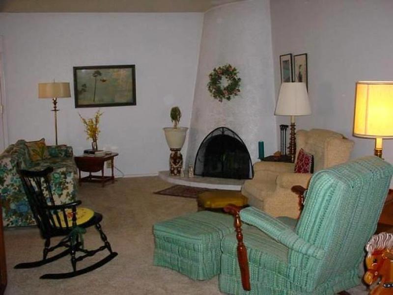
I am all for up-cycling and passing down from generation to generation, but there are some things thats time have come and gone. When you come up on a truly updated piece, it is better to let it go despite the memories attached. That way you can find something that suits new needs and pass that on instead.
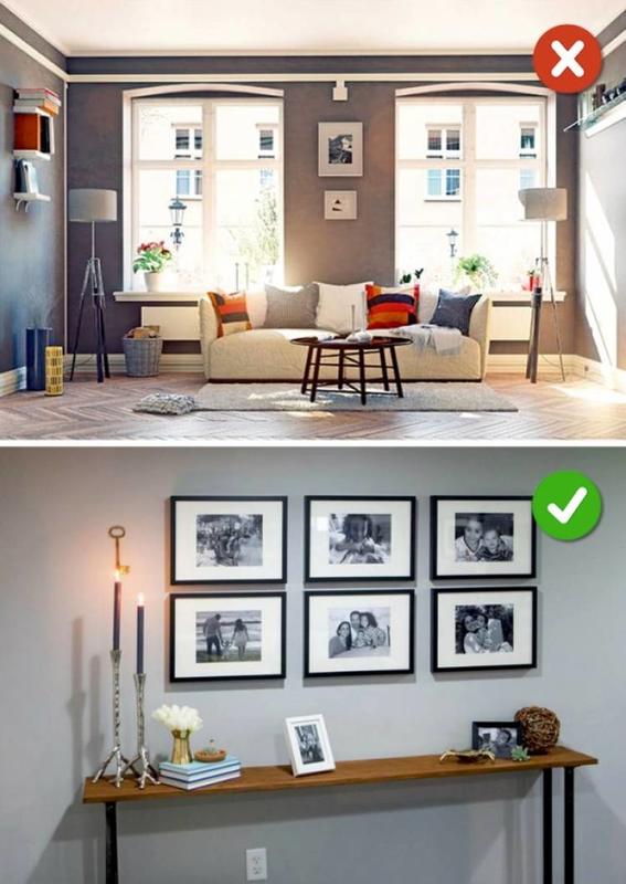
Almost everyone has photos in their living room, it is how you can easily look back on fond memories and showcase your life and memories to visitors. You may think it is as simple as putting a frame on a picture and tossing it on the wall, but it is not! Make sure you select frames and locations that match your furniture style.
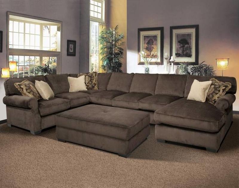
Sorry Texas, but bigger is not always the best. This is especially true when it comes to furniture choices. Giant couches like this one clog up spaces and rarely are needed. How many times are you really going to have 15 people sitting on the couch at one time? Better to go for smaller pieces that won't clog up the space.
Although it can be tempting to try and recreate your favorite pinterest page in real life, someone else's style will rarely fit perfectly into your own home. When decorating a space first make a list of the ways you will be using that space and build around the functions needed.
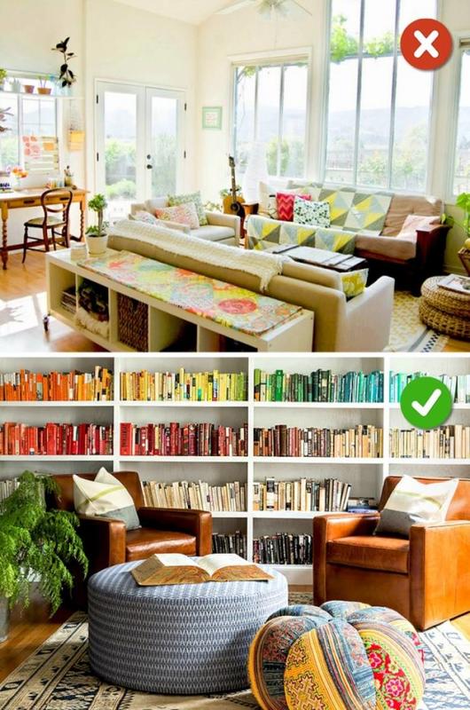
This seems so obvious but it can easily get overlooked when thinking about the bigger pieces, but just like a dining room table at the holidays needs a centerpiece so does a living room. Something with a pop of color or an interesting antique will tie the whole room together and show an eye for detail.
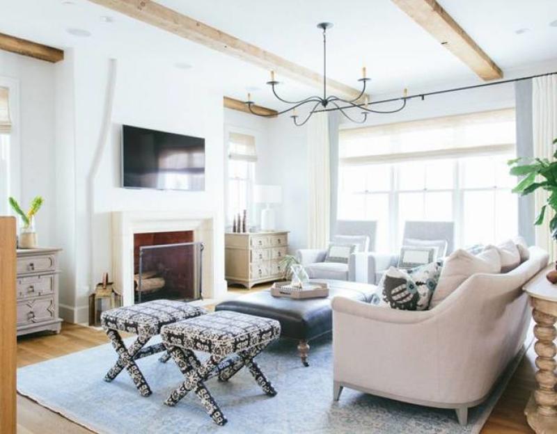
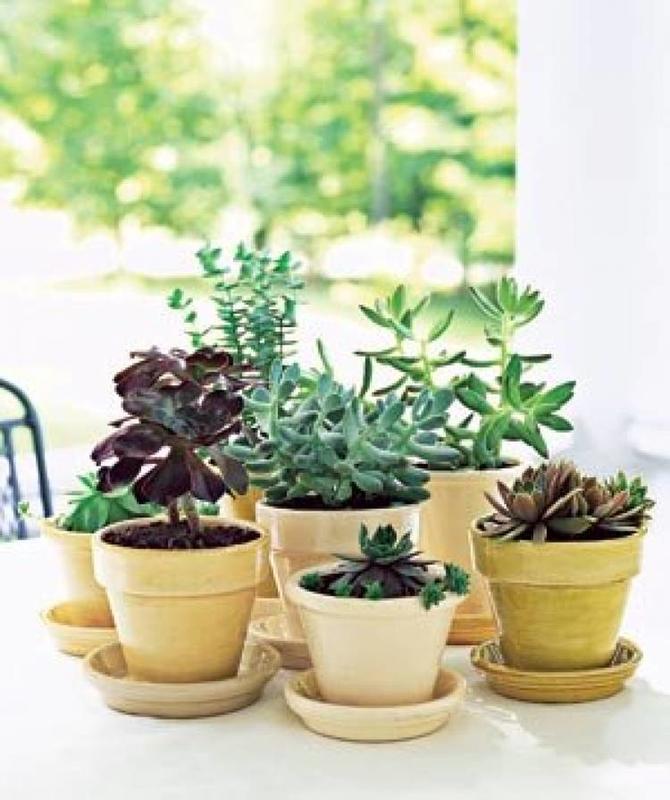
Currently there is a huge trend, spurred on by pinterest users everywhere, of having succulents (a type of plant) as a cute accent in your home. This can be a good add, but only if it fits with the existing design. Additionally make sure any plants you have are in pots that fit their size or they will not last you long.
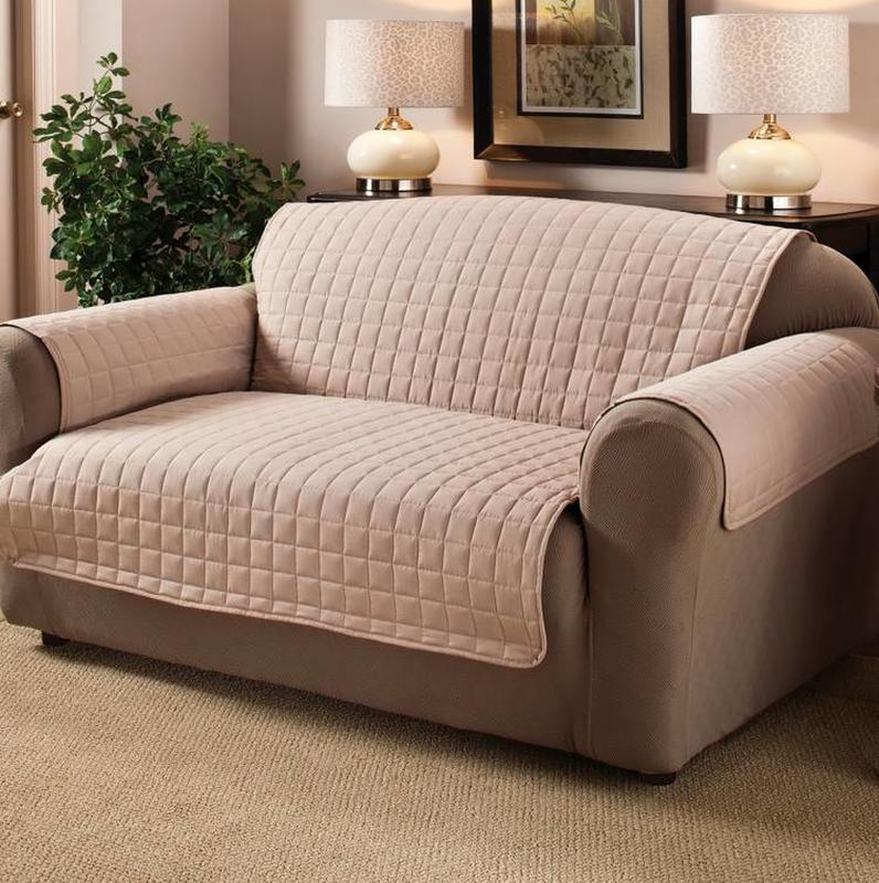
Don't get me wrong the functionality of a sofa cover us undeniable, but sometimes it is not worth the terrible design! If you are going to get a sofa cover make sure that it is tailored to your specific sofa and in fitting with your color scheme so that you do not detract from all of the hard work you did on your decorations!
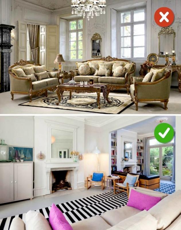
Although it is good to pick a theme and stick with it, there is such thing as going too far. Just like in the way you dress; You can favor a certain style but if you commit too hard then you look like you are in costume. Have a theme for your spaces, but don't be afraid to branch out to make it a bit less extreme.
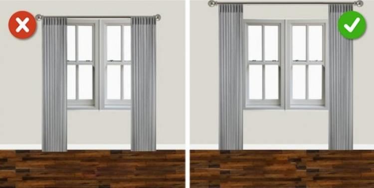
This is the final secret hack! The way you hang your curtains can make the room look several feet bigger or smaller. By placing the rod a bit above and slightly wider than the windows themselves you will give the impression of more light and an overall larger room.
